Why NI Mug Co. ?
In our next issue of "The Mug Life" we ask the question... why NI Mug Co.? Why did you land on that name? Where did it come from? One of the key factors in starting your own business, for me, is nailing the name of that business. Making sure that what you do is clearly portrayed in the name. When we started back in 2019, I wanted a name that told people where we are from and what we did.
We are very proud of where we are from and it is important to us that people speak highly about good business from our wee country.
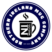
Truth be told our actual name is the "Northern Ireland Mug Company", but that is a bit of a mouthful to say every time, so we shortened it to NI Mug Co. If you take a look at our logo, you can clearly see both there. Regardless of what we are actually called, people still refer to us as "NI Mugs" and that's ok for me.

So in the logo, you can see both our full name and our 'go to name'. You can also see a mug of coffee in there, indicating that yes we print mugs. In the beginning it was our sole intention just to make mugs, but as we progressed we quickly realised that that was only one part of the market and that there are loads more products out there. So we tried others and worked out what was best for us with the equipment and space that we had and settled on a select few products - we think it is best to do some really well than try to do everything poorly. Our short product list is refined to mugs, water bottles, coasters, pin badges, magnets, bottle openers and shin pads (more on those in a future post).
I'm digressing. Back to the logo. Where do you even start to come up with a shape, colours, size, font? Obviously we done our research. We looked at other sublimation companies logos, we looked at coffee company logos, we looked at famous brands. In the end we settled on the round logo you can see. Starbucks, Costa and the Fair Trade logo are also round and if it's good enough for them it is good enough for us. We made the colour navy because it is one of the colours that represents Northern Ireland - the other being green, but we didn't think it was strong enough to stand out at the time. Now we are happy to change the colour depending on how it is being used (for example all black on a shirt sponsor).
You may also notice that is says "Est 2019" along the bottom of the logo. Again this was important for us. At the time, it was a risk. We didn't know if people would use us because we were only starting out. But now as the years progress, people knowing that we have been doing this for a number of years adds credibility to our work.
And that's the story behind our logo and company name.


